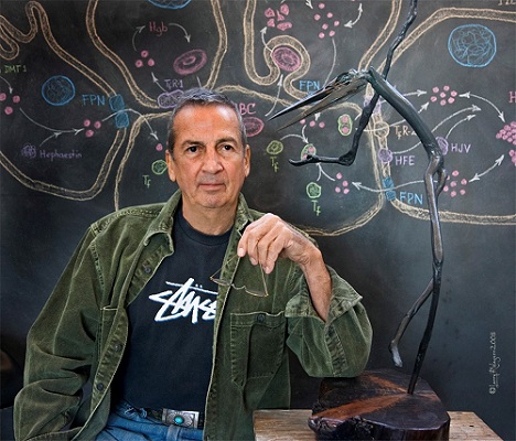
Artist, physician-scientist, and longtime ASH member Dr. Donald Paglia talks about both of his ongoing contributions to ASH - its famous logo and his annual donations to help further the careers of others.
Can you share a little about the history of ASH's logo?
The evolution of our logo has a long and "interesting" history. The Society had no logo until an early president asked an artist friend of his to create one. It was indeed a brilliant design: four circles in a diamond configuration with two opposing circles connected by a thready isthmus, as though pulling apart in cell division.
That initial design was adopted and used by ASH until my principal mentor, Dr. Eugene Cronkite, became President in 1971. During our annual meeting in San Francisco that year, I was on a year's leave of absence from UCLA and painting intensively in preparation for my first solo art exhibition. I should have recognized then that the ASH logo displayed so prominently throughout the meeting venue was more than just a little familiar. In fact, it was identical to the trademark of a primary supplier of artists' materials, displayed on virtually every tube of oil paint in my studio. When I pointed this out to Eugene, he immediately apologized to the supplier about the inadvertent transgression, and they viewed it as a "no-harm, no-foul" incident since ASH had terminated its usage. Fortunately, that was in a far less litigious time.
How did you become involved in the current logo design?
The current ASH logo resulted from an international competition organized under Dr. Frank Bunn's leadership as ASH president. Proposals were submitted by the membership, and mine was eventually selected, but not without controversy. Some felt there might be too much resemblance to the classical yin yang symbol of Chinese philosophy and wanted to avoid any such philosophical, religious, or other connotations. Certainly, none was intended. The design evolved from my attempt to have every component of ASH membership graphically represented - a challenging goal for a group that was rapidly differentiating into multiple subspecialists.
What is the logo's intended symbolism?
The paramount goals in logo design are symbolism and simplicity, not necessarily in that order. I chose the circle as a universal symbol that can mean whatever we choose it to mean. The left portion was meant to be a stylized droplet representing all those who are engaged, clinically or in research, with the fluid components of blood, such as transfusion medicine and coagulation. Progressively smaller circles within the negative space on the right represent those of us focused more specifically on white cells, red cells or platelets, respectively. A laurel branch surrogate at the bottom of the logo is notDNA as some interpret, but was intended to represent a generic protein molecule that progresses from intact on the left to fragmented on the right, symbolically extending through the clinical spectrum from normality and wellness to disorder and dyscrasias.
To this day, I remain honored that the pen-and-ink original hangs on a wall in the office of my friend, Frank Bunn, and that the Society continues to value it as representative of our organizational identity.
What is your strongest motivator for supporting ASH programs?
I support ASH programs as one tangible means to acknowledge my indebtedness to others. My annual donations are designated to honor (or memorialize) the individuals to whom I owe so much, personally as well as professionally. I have been privileged to be taught and befriended by, to come under the guidance of, and to be inspired by so many who inhabit this pantheon of Hematology. The enormity of such debts can only be compensated by extending their legacies into the future. That is not an original concept, but, like the ASH logo, it still works for me.
Visit www.hematology.org/foundationwww.hematology.org/foundation to learn how you can support ASH programs.

